Regression Line
The line on the scatter plot presented below represents the regression line or "line of best fit". While the correlation coefficient provides a single numerical estimate of the relationship between two variables, the regression line gives a visual presentation of this relationship. We can use the regression line to predict a value of "Y" for any "X" score. The steepness of the angle of the regression line is called its slope. It is the amount of change in "Y" that we can expect for any unit change in "X".

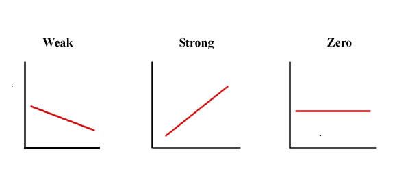
We can compare the slopes of the regression lines presented below to estimate the overall strength of the relationship. It is clear that the last plot is perfectly flat, with zero slope. This represents no linear relationship between variables. The first plot shows a modest negative relationship between variables. The second plot shows a strong positive association.
We have now reviwed each of the concepts needed to estimate and plot the relationship between two variables. Proceed to the scatter plot exercise by clicking on the "Plots" button below.
| Click here to review correlation coefficient: | |
| Click here to review effect size: | |
| Click here to review bivariate plot: | |
| Click here to begin your scatter plot exercise: |