Bivariate Plots
A bivariate plot graphs the relationship between two variables that have been measured on a single sample of subjects. Such a plot permits you to see at a glance the degree and pattern of relation between the two variables. On a bivariate plot, the abscissa (X-axis) represents the potential scores of the predictor variable and the ordinate (Y-axis) represents the potential scores of the predicted or outcome variable. Each point on the plot shows the X and Y scores for a single subject. This is what we mean by "bivariate" plot -- each point represents two variables. A bivariate plot of two scores (self-esteem and Interpersonal Avoidance) from our class dataset is shown below. The red line on the graph shows a perfect linear relationship between the two variables.

As can be seen, the points on this graph do not follow a perfect straight line. The distance of the points to the line is called "scatter". A large amount of scatter around the line indicates a weak relationship. Little scatter represents a strong relationship. If all points fall directly on a straight line, we have a perfect linear relationship between our two variables.
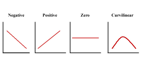
We also look at the graph to determine the direction of the linear relationship. A line that begins in the upper left corner of the plot and ends in the lower right corner (like the relationship shown above) is called a negative relationship. In a negative linear relationship, high scores on the X variable predict low scores on the Y variable. In the example above, high levels of self-esteem are associated with low levels of interpersonal avoidance. A line that begins in the lower left corner of the plot and ends in the upper right corner is called a positive relationship. In a positive linear relationship, high scores on the X variable predict high scores on the Y variable. Scores scattered randomly around a straight line in the middle of the graph indicate no relationship between variables. Sometimes a scatter plot will show a curvilinear relationship between two variables. If this happens, we need to use special statistics developed for curvilinear relationships. Each type of relationship is presented below.
| Click here to review correlation coefficient: | |
| Click here to review effect size: | |
| Click here to review regression line: | |
| Click here to begin your scatter plots: |